(Updated January 27, 2016 after having enough time to fix some math errors and typos.)
“The very fact that this is beyond some of our technological limits is a message -“
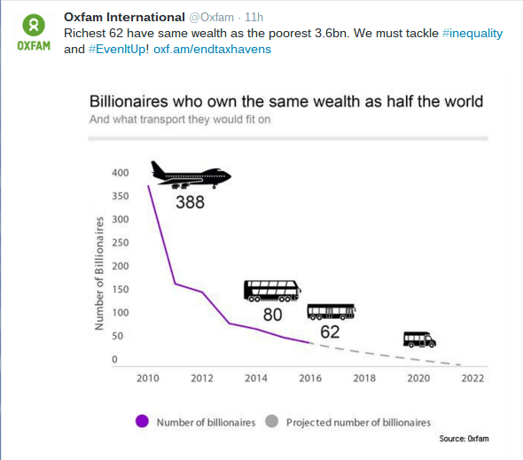
Wealth inequality is so staggering that the nearest analogy are astronomical numbers, and astronomical numbers are so hard to grasp that most folks don’t worry about them. Besides, look at all those stars streaming by on Star Trek and Star Wars. About a week ago, Oxfam released their annual wealth inequality report. As of the end of 2015, 62 people own as much wealth as half the population of the planet. I’ve been tracking it over the years, and the trend has me worried for the global economy. There are several representations of the previous years’ situations, but the extreme nature of the situation has become literally unimaginable. Our brains don’t deal well with vastly different numbers and tend to slip from reality into abstraction. Unfortunately, there are real world implications and they are manifesting faster than many of the other global issues. The above quote came from a Facebook discussion as a few creative people tried to find a way to use graphics instead of math or words to communicate the extreme disparity. What we didn’t expect was to find that wealth inequality has reached the limits of the human eye, the limits of computer software, and the limits of physically creating a visual tool – at least reasonably. We’re continuing with some of the less reasonable approaches because working on the problem has revealed to us how massive the problem is, and how difficult it will be to resolve.
Here’s an edited version of the conversation that steps through our increasing awareness. The individuals involve creative people who are educated in handling large numbers (engineering, marketing, image processing, and manifesting large projects) and people who have experience communicating (photographers, painters, writers, film producers). Wish us luck.
Tom
Hello, fellow digital artists. I’m interested in creating a graphic to demonstrate wealth inequality. I think the debate can benefit from someone creating a graphic that shows 62 pixels (representing the number of people that own half the wealth of the planet) and also shows 3.5B pixels (representing half of the people of the planet.) I’ve got a way involving copy and paste (which is tough to keep track of), which I might do, but I suspect that at least one of you has a better way to display it. Any ideas?
Joe
I could come up with something…
However, showing 3.5B pixels will take an enormous image. Have you considered showing with a single pixel equaling some larger unit than 1?
Tom
We’re thinking along similar lines. Another option is to show 1 pixel surrounded by 56,451,612.
(That’s 3,500,000/62, or how many people the average member of the 62 matches in wealth.)
Brian
You won’t be able to see that pixel.
Tom
Is that 7,513 pixels by 7,513 pixels? Check my math.
Brian
Yep. Still won’t be able to see that single pixel.
Kinda the point though, isn’t it?
(A limitation of the human eye)
Linne
Pyramid?
A long/wide rectangle, center point (needle, like in a haystack) line with a callout?
Joe
Yeah, the only way to really do it is to create an image of the full number of units. But that you would have a number of them equal “1”; otherwise as Brian said, you wouldn’t be able to see individual pixels.
So you’d need like maybe four pixels per unit of 1 to see them, perhaps even more, to distinguish them as units with a stroke around each unit.
Since the smallest a stroke can be is 1 pixel, you’d actually need a few more inside to be visible; so, it’s those plus the surrounding pixels per strike just to equal one unit. And then multiply that by your 3.5B – so – yeah, an enormous image size. No Web browser could easily display that.
Now – thinking this through – it’d be a tedious task, but if you did it in vector, it could be scaled on the Web as an svg file.
You’d have to use single point dots with some separation between them…otherwise they’d look like a halftone pattern or just a field of noise.
I can run some experiments.
(A limitation of computer software)
Tom
I’m thinking of a real world print that we could then use as a prop in photos shared on social media – staged with a magnifying glass.
Joe
So herein lies a problem:
The largest photo ever taken, a 411 image composite by the Hubble, comes in at pixel dimensions of 26,004px X 9,289px.
And yet that is, while ginormous, “only” 214 Million pixels.
You want billions.
For some perspective, at print size of 300 pixels per inch, that would be about 7.2 feet long.
However, you can’t see pixels at 300 per inch (which is kinda that point with intentionally good prints).
To be able to barely discern individual pixels, you’d have to print at about 50 pixels per inch. So that would make this relatively small (compared to your requested image size) image (of the largest photo ever) a whopping 43 feet long.
Your image would need to be literally 16 times this size. To “see” the pixels.
(A limitation that illustrates the quality of fine art prints)
(A limitation that illustrates practical considerations of printing, displaying, and sharing such a representation.)
Joe (hours later)
I tried it out this morning with the 7,513 pixel per side image; with basically a checkerboard pattern black/white pixel per pixel. As expected, zoomed out it’s just gray. Zoomed in a little more it’s a moire pattern that makes my eyes all wonky. And, zoomed to print size at 50 pixels per inch – well – it’s still a wonky pattern.
This is a good way to show it; starting around the 1:15 mark.
https://www.youtube.com/watch?v=uWSxzjyMNpU
Tom
Yep. Saw that video. It is now three years old. It serves its purpose, but I think there is a need for a static image, or an image like Chris Jordan’s images.
(A limitation based on time, because any representation that takes time to create is therefore obsolete, like that video from 2013 when the wealth inequality was five times fairer than now, in 2016.)
Joe
Well, that’s a good point: Chris is able to show it BECAUSE he zooms in and out in the animated versions on his website.
The static images, however, if printed, can work too; but each object has to represent a higher number, which is how he’s done it with all of his Running the Numbers series. It’s always an enormous number of objects, but only a fraction of the larger number he’s representing by breaking it down into understandable chunks.
It would take 35,000,000 $100 bills; but if broken into chunks that could be replicated a thousand times – then – oh god – it would still take 35,000 replications. Which, if you had only one minute per replication/movement/placement of each cluster would still take 583 hours to produce. Also would probably crash Photoshop.
Back to the drawing board……….
(So the only way to make the problem visible is to scale it down by factors or ten or a hundred.)
(A new limitation based on computing hardware and software)
Tom
The very fact that this is beyond some of our technological limits is a message.
Thinking 3D. If one person is represented as a cube, the others are represented by a cube 383.6 longer, taller, and wider. So, if one person is represented by 1 cm3 (a sugar cube), then the rest are represented by a cube 383.6 cm X 383.6 cm X 383.6 cm, or 3.836 m x 3.836 m x 3.836 m. (12.85 feet per side) That almost sounds like the interior volume of the Store foyer. Build a cube of 12 long sticks draped with fabric and one little cube beneath or on top or beside – suspend from the ceiling.
Also could be a sphere with a radius of 288 cm. How big is that globe they hang in the foyer?
At this point the conversation shifted to Joe and I playing with ideas in his workspace, Fine Balance Imaging, where we could experiment, and reach new limits.
We could find various ways to represent the inequality, but then they were difficult to photograph. How do you make and where do you put a 12.85 foot (383.6cm) cube that represents the wealth of 56,451,612 people which equals each the wealth of one of those average billionaires? How about a sphere with a radius of 238 cm, which is a diameter of 476 cm beside a marble? A tetrahedron would be 782 cm tall. Maybe use something more familiar and work backwards, like a standard shipping container that we see on ships and trucks which has a volume of 1,360 cubic feet that would be empty except for a tiny box 1/56,451,612th as small: a 0.347 inch cube? Or how about making the billionaire one grain of sand (.25mm radius) and a cube of sand 4.16 inches per side (10.5cm)? That may go too far the other way.
Brian then passed along a different approach. Instead of going 2D or 3D, go 1D. Here’s where metric make so much more sense. If one billionaire was one cm, then a line representing their equivalent poor population would be 56,451,611 cm long, or 5,645,161.1 meters, or 5,645.1611 kilometers. Think English (but not British because most of them are smart enough to use metric, but not us Yankees) and get 3507.7405 miles. Start with one centimeter on the west coast of North America and you can end up in the Atlantic. Wealth inequality that doesn’t even fit on a continent. At least NASA or the NSA should be able to photograph it, but not well enough to show that first centimeter.
Check my math. When the numbers become so overwhelming it is easy to lose perspective. And, that’s the point. Wealth inequality has reached such a point that it is hard to imagine, tends to become and abstraction, gets discussed in ideological terms. My approach is from an understand of math and systems. When great key resources become vastly concentrated, systems destabilize. If that instability is left uncontrolled, the effects on the rest of the system can be dramatic, traumatic, and catastrophic.
As one private message reinforced from my previous post;
“When half the world’s wealth is stagnant, the world’s economy loses half of its chief resource.”
The wealth is accumulating. Economies are stagnating. If only we could find a way to show that.
PS To help my friends’ wealth, here are links to some of their work.
